

Intro
This guide covers how to work inside the tool once you’ve opened “explore the data” or a starting point. For an overview of what ROM does and who it's for, start at the ROM landing page
Map views
How to lay out, populate, and navigate the map panels.
Layout selector
Four icons at the top of the map area switch between panel layouts:
 Single: One full-width map panel.
 Side-by-side: Two panels split horizontally — useful for comparing basemaps or layers, e.g. satellite vs. surface reflectivity.
 Stacked: Two panels, one above the other.
 Quad: Four panels in a grid, each independently configurable.
Per-panel controls
Each map panel has its own toolbar:
 Basemaps icon: Choose which raster layer or basemap this panel shows.
 Overlays icon: Choose which layer(s) to overlay on top of the basemap, and turn on/off both boundaries and labels separately.
- Fullscreen: Expand this panel to fill the browser window.
- Pin: Lock this panel's view in place while you adjust others.
In the bottom right corner of each map is the legend identifying which layer is being displayed, its color ramp and any overlays visible.
"Zoom to Selection" recenters and zooms all panels to the tracts currently selected. The

You can select/deselect a specific census tract by clicking on it in the map view, as well as from the table or query selection.
Filters & queries
Narrowing the full set of census tract down to the ones that meet your criteria.
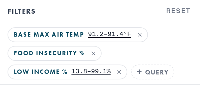
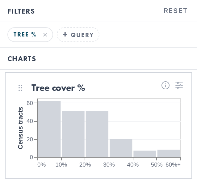
Each chip represents one variable. Chips that show a value range underlined mean that your selection is narrowed to that range. Chips that do not show a value range are not narrowing your selection.
Click Reset to clear every active filter at once, or the "×" on an individual chip to remove just that one.
Creating a query
Create a new query by clicking the +query pill.
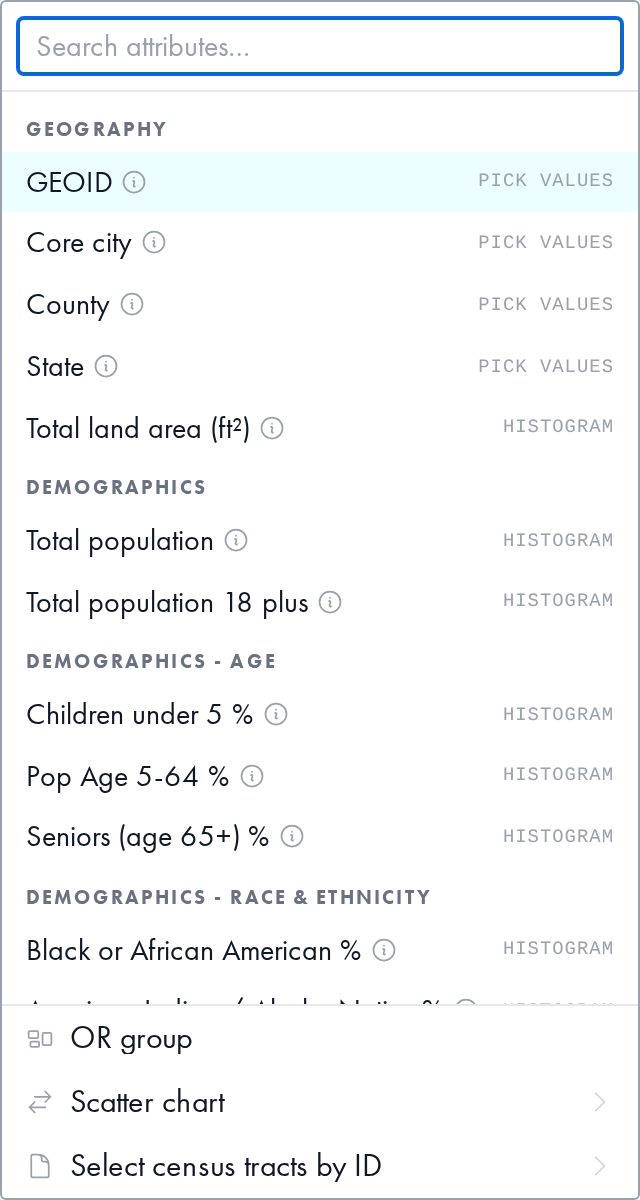
The list of queryable attributes will appear, you can scroll through or search for a particular one.
Once you select an attribute, your filtering chart will appear.
To select tracts you can either click and drag across the chart area to choose values within a particular range, or you can click a particular bar on the histogram to choose all those values. Your selection will automatically update and display in purple across all charts, maps, table rows and the selection tab of the details pane. To clear your selection on that chart, slick any empty space within the chart area.
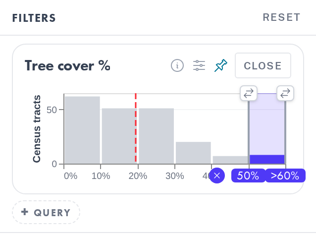
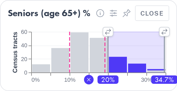
The settings icon allows you to add reference lines to the chart, such as the mean and median. The pin
  icon promotes this chart into the Charts panel below, so it stays visible even after you close the filter card.
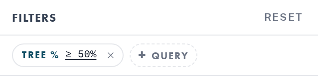
To edit a current selection, click on the chip with that variable and adjust your selection range on the filtering card chart. Close the card when you are finished editing.
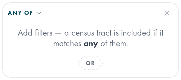
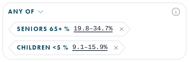
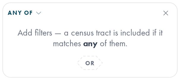
There are 3 additional options for in the +query menu. You can create an OR group, which allows you to narrow to tracts that meet on of multiple criteria in addition to the rest of your query.
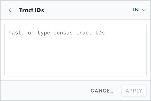
Additionally, you can also add a scatter chart to explore the relationship between two variables. (See the charts section below for more information) and you can manually input census tract ID’s to add or remove from your selection.
Charts
Pinned distributions that stay visible as you refine your selection.
Charts are created from the +Query interaction. There are two types of charts available: histograms and scatter charts. Charts
Histograms
To pin a histogram chart select the  icon while the querying histogram is open. Charts pinned from a filter card collect in the Charts section beneath Filters. Each chart is a histogram of census tracts across one variable's range, drawn in gray for the full dataset with the currently selected/filtered tracts overlaid in purple. To edit a chart, click on the chip with that variable in the Filers section. Close the card when you are finished editing.
Scatter Charts
In the +Query interaction select Scatter Chart from the bottom of the pop-up.
From the following list of attributes first choose your x-axis value, then choose your y-axis value. Your scatter plot will appear in the Charts section of the left-hand pane, with each dot representing one census tract.
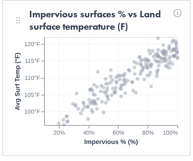
To reorder your charts, click on the  icon in the top left corner of each chart and choose the chart order
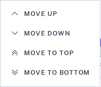
You can also click and drag the chart to your desired order in the charts section.
Details pane
The right-hand panel summarizing whatever tracts are currently selected. To view a summary of all tracts, switch the tab at the top of the pane from “Selected” to “All”
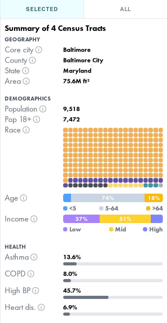
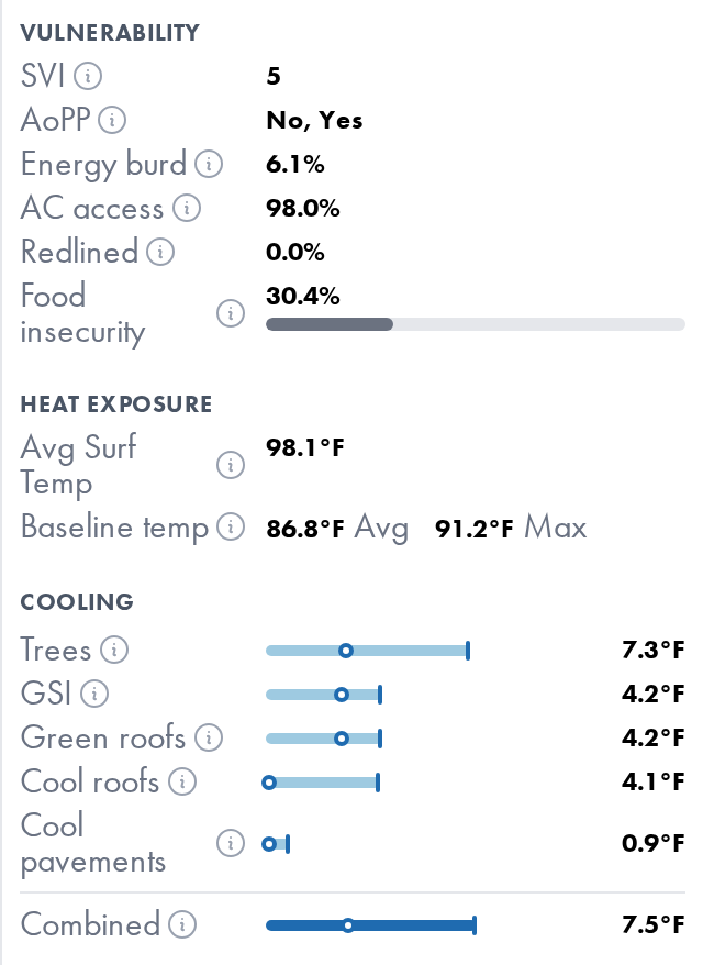
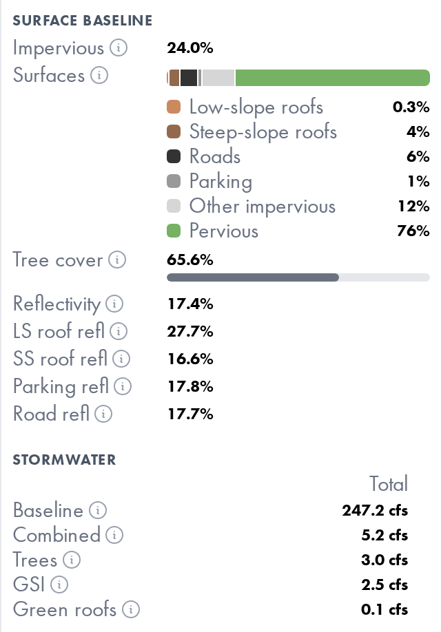
Titled "Summary of __ Census Tracts," this panel groups key statistics into categories:
| Category | Fields |
|---|---|
| Geography | Core city, County, State, Area |
| Demographics | Population, Race breakdown, Age distribution, Income distribution |
| Health | Asthma, COPD, High blood pressure, Heart disease |
| Vulnerability | Social Vulnerability Index (SVI), Area of Persistent Poverty (AoPP), Energy Burden, Air Conditioning (AC) access, Percent Redlined, Food Insecurity. |
| Heat Exposure | Average Surface Temp, Baseline Air Temp (Average and Max) |
| Cooling | Combined Smart Surface Scenario Cooling (Average and Max) |
| Surface Baseline | Percent Impervious, Distribution of Surfaces, Percent Tree Cover, Reflectivity, Low-slope roof reflectivity, Steep-slope roof reflectivity, Parking Reflectivity, Road Reflectivity |
| Stormwater | Baseline runoff, Combined scenario stormwater runoff reduction |
Every metric includes an info icon that opens a short definition, source note and aggregation details. Some data visualizations, such as Race and Cooling, display more details about the data when hovering over the chart area.
Some of the data included in the ROM is not available for all census tracts. Census tracts without data are not represented in the aggregation. If the data is unavailable for a substantial amount of census tracts, a warning icon will appear. Hovering over this icon reveals the number of tracts included in the aggregation. A gray warning indicates that the missing data would have a small potential impact on the aggregation. The red warning means that a significant amount of data is missing, and to interpret the aggregation with caution.  For more information about the data provided in the ROM, view our data dictionary.
Data table
The full record-level view beneath the map, one row per census tract.

The top bar of the chart will list your selected number of tracts.
Rows Selecting the filter icon  displays only the selected tracts in the data table. Pressing it again will show all tracts.
Rows shaded light blue indicate tracts that match your current filters/selection. Clicking on a particular row in the table will add/remove that tract from your selection.
Columns All columns are sortable by clicking on the column header. The initial sort will be ascending, click the header again to sort descending.
Scroll to the right within the table to view the full data table. Selecting the columns  icon will limit the table to only show the columns that correspond to chips in the Filters section. Pressing the icon again will restore the table to its default state with all variables present.
- Clear Selection: Deselect all currently selected tracts.

Export
Export data for the selected census tracts. Select the Export button at the top of the data table 
Export Table
Exports the current data table as a csv. Values are expressed in their raw form so as to facilitate further analysis.
Create Report
Generates a polished pdf report, ideal for sharing, that gives a summary of the selected tracts and how they compare to the city-wide area.
Snapshot Files
Save map sessions and share them with other users.
Clicking  downloads a .edn file to your device.
To load a snapshot, select “load a snapshot file” on the ROM Landing page and upload your .edn file. This will bring up the session exactly as you left it.
Worked examples
Step-by-step walkthroughs for common planning questions.
Example 1: Age and Heat Risk - Identifying Vulnerable Communities
The literature on age and heat risk shows that seniors 65+ and children younger than 5 are the most vulnerable to extreme heat (Centers for Disease Control and Prevention [CDC], 2024; Clark et al., 2024). The query tool allows us to identify the hottest census tracts that have a high percentage of seniors OR a high percentage of young children. Understanding where vulnerable groups are most exposed to heat can make it possible to target interventions where they are needed the most.
Step 1: Press the +Query Button under the Filters section. Step 2: Select “OR Group” from the menu that pops up. The OR Group option allows users to select more than one query. To select variables to query press “OR” in the dialogue box.
Step 3: Let's say we wanted to find the tracts in the 75th percentile for seniors. Select the icon to add reference lines. The ROM allows users to show reference lines for the mean, median and interquartile range (IQR). To highlight the 75th percentile, select the IQR and drag the slider to line up with the upper reference line and stretch it to cover all of the remaining census tracts above that line.
Step 4: To add another query to the OR group, highlight over the senior query until an “OR” button pops up in the bottom left of the senior query. Press the OR button, and repeat the process for children.
Step 5: Once we have the 75th percentiles for both seniors and children, it is time to add the temperature query. Since we are looking for tracts that have a high temperature AND a vulnerable population, do not add temperature to the OR group, instead add a new query (+query) and select “Baseline Air Temperature (F). To show the 75th percentile of heat, add gridlines and select all above the upper line.
Step 6: These three queries leave a subset of census tracts. The selected pane on the right gives a summary of the selected tracts, and the table below allows users to view each of the queried tracts separately. To unselect an individual census tract, click on it on the map and it will be removed from the query. Clicking on a tract outside of the selected tracts, will add it to the query.
References:
Centers for Disease Control and Prevention. (2024). People at increased risk for heat-related illness. U.S. Department of Health and Human Services. https://www.cdc.gov/heat-health/risk-factors/index.html
Clark, A., Grineski, S., Curtis, D. S., & Cheung, E. S. L. (2024). Identifying groups at-risk to extreme heat: Intersections of age, race/ethnicity, and socioeconomic status. Environment International, 191, Article 108988. https://doi.org/10.1016/j.envint.2024.108988
Example 2: Scatterplot with Additional Query
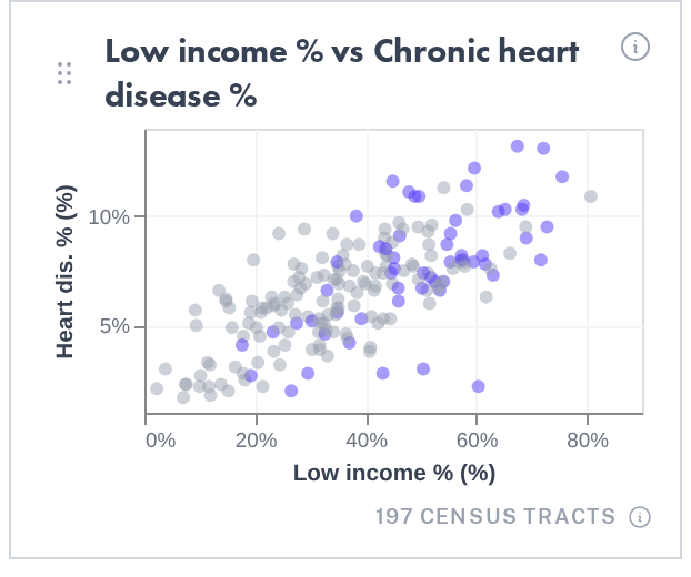
One of the powerful features of the ROM is its ability to generate scatterplots and demonstrate the relationship between two variables. In addition, if there is an additional selection made through a query, the selection will highlight on the scatterplot to indicate which tracts are selected.
Step 1: Make a scatterplot. Press the +Query Button under the Filters section. In the pop-up menu select “scatter chart.” The menu will then prompt you to select your first attribute, the X axis. Once selected, it will then show the same list of variables to choose the Y-axis. For this walkthrough, let’s explore the relationship between heart disease and income, by putting % low income on the x-axis and % chronic heart disease on the y-axis.
Step 2: Choose another variable to query on. For this example, select Air conditioning access %. Drag the slider to select the lowest quartile — the tracts with the least access to air conditioning. The census tracts that are selected are highlighted purple, allowing the user to see their selection with the relationship between two other variables.
Frequently asked questions
What areas does ROM cover?
ROM v1.0 covers the municipal boundary of Baltimore, Maryland with all data interactions at the census-tract level.
Is ROM free to use? Do I need an account?
ROM is free and open to the public. You don't need an account to explore the map, filter data, or export results. Signing in is only needed for saving preferences or partner-specific features, if applicable.
How current is the data in ROM?
Datasets are pulled from a mix of sources with variable update cadences. The ROM generally reflects the most up to vintage available from each source. Check our data dictionary for more information about data sources.
Can I use ROM to evaluate a single address or building?
ROM is built for census-tract-level analysis, not parcel- or address-level precision. Use it to identify priority areas, then pair it with local site assessment for specific properties.
What is a snapshot file, and how do I share one?
A snapshot file captures your current filters, layers, and selected tracts so a colleague can reopen the exact same view. You can create a snapshot file from within the Export menu in the tool, and upload your snapshot file from the ROM landing page.
I’m seeing the ROM from outside the city of Baltimore. Can I request that ROM add my city?
Yes! Use the Contact us link to submit the feedback and bug form to get in touch with our team.
What browser should I use?
ROM works best in a recent version of any browser, however some map interactions may be limited on mobile devices.
How do I report a bug or suggest a feature?
Fill out the feedback and bug form with a description of your issue/suggestion. Please give us as much information as possible (including screenshots if possible) to help us fully address your concern.
Do I need GIS experience to use ROM?
No. ROM is designed for planners, advocates, and civic leaders without a GIS background. No specialized experience or software is required.
Feedback & contact
To suggest improvements, provide feedback, report bugs, or contact us, use our feedback and bug form. The form can also be found on the top-right corner of the ROM. If you are reporting a bug, please be as detailed as possible and provide screenshots. We appreciate your feedback as we continue to improve the tool.